Knowledge vs Skills: Graphs
If you’ve clicked on this blog about graphs, I’m going to assume that you’re reasonably confident in your ability to interpret them. You might even have advertised your competence with ‘graph skills’ on your CV at some point. But I don’t think ‘graph skills’ are really a thing. I think there are so few generic qualities of graphs that any quality interpretation is a function of your knowledge of the subject matter and not what you know about graphs. Consider the graph below — what do you make of it? Note: this isn’t a blog about physics so you really don’t need to stop reading if the physics puts you off.

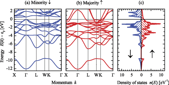
This is a series of three graphs from my old field of physics research — condensed matter physics. What I see when faced with these three graphs is the explanation of why iron, cobalt and nickel are magnetic and for why they have different magnetic moments (feel free to message me about this if you’d like to know more). None of my interpretations would be of the “as x increases, y increases” sort for these graphs. Without a background knowledge of the subject of the graphs, interpreting a graph can’t be done in any meaningful manner.
I’m going to draw a distinction between reading a graph and interpreting a graph. We can see that reading a graph might well be considered generic, but is rarely what we’re actually seeking for a true understanding. Interpreting a graph takes the results of this reading and filters it through your background knowledge, leading to the insight.

The majority of graphs we see are formed from two-dimensional data. The fundamental generic idea is that our data forms a pattern that moves through a space formed by two perpendicular number lines. The first step to being able to read a graph (and this is any graph) is that we (or students) need to be able to explain the three situations (a), (b) and (c) in the figure above:
(a) — as the value on the x-axis increases, the value on the y-axis increases
(b) — as the value on the x-axis increases, the value on the y-axis decreases
(c) — as the value on the x-axis increases, the y value is unchanged
If students can do this, then they can read a graph. We should absolutely ensure that students can read graphs and maybe this might change the initial emphasis of our instruction around using graphs in KS3. But from hereon out, their ability to do anything else with a graph depends almost exclusively on their knowledge of the subject matter of the graph.
Why is it then, that interpreting a graph feels like such a generic skill? If we consider graphs that are commonplace in the news, we can see that it’s because the content of the graph is widely understood by the majority of people and so they can both read and interpret the data.

There can’t be many graphs that have been seen more widely and frequently than the COVID cases one above. The reason we’ve all been able to interpret it is that the majority of the country has a good understanding of the quantities on each axis and the relationship between them. A generic interpretation could be “after 4th Dec, the cases increase rapidly over time until February”. If you’d been in a cave during this time (which I guess all of us sort of were, but you know what I mean…) and had no knowledge of the pandemic, then linking this increase to a possible explanation would be impossible as you wouldn’t have the required knowledge. But the majority of us are all too familiar with the landmark moments in the pandemic and so can link features in the graph to specific events that occur along the x-axis.

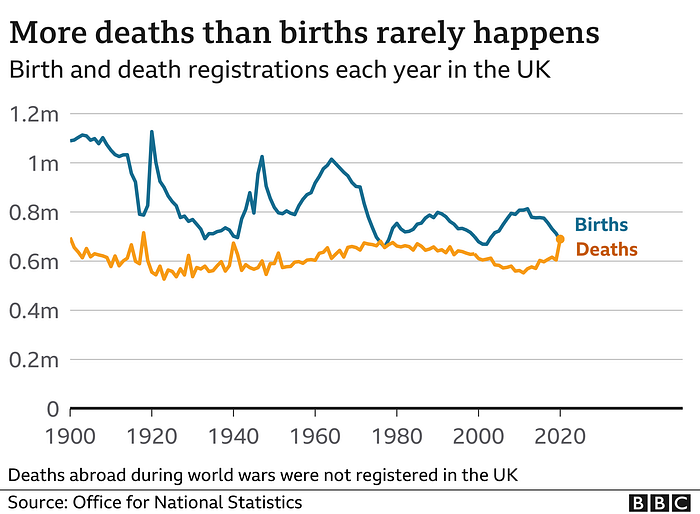
Here is another example where the quantities on the axes are very easily understood and so useful interpretations that go beyond “over time, deaths have remained roughly constant” are possible by the majority. The uptick in deaths in 2020 requires a knowledge of the existence of the COVID pandemic but if you didn’t know about this, all you can say is “deaths went up in 2020”. Most people are also reasonably familiar with the sorts of changes that have occurred in this country to give some rationale for the general decrease in the births (in spite of the increase in population). The spikes in births in the 1920s and 1940s can also be interpreted by a significant portion of people as they have an understanding of the timing of World Wars I and II.

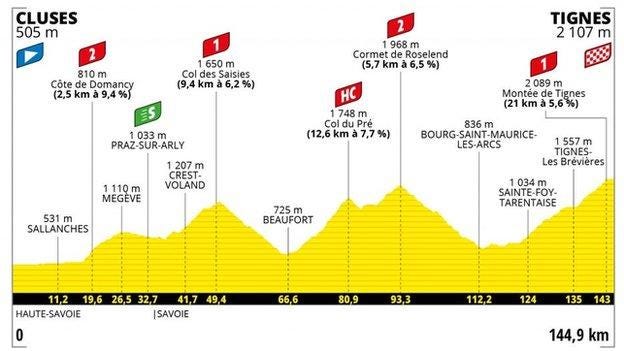
Graphs in the news that go beyond having time as their x-axis are few and far between. I’d imagine that this stems from the fact that time is a quantity that is so easily understood by the majority of people, and you need to guarantee that people are familiar with the quantities on both axes if you’re running mainstream news. The above graph is a rare example of a non-time-evolution graph. If you didn’t know anything about the Tour de France being a bike race over big hills, could you interpret this in a meaningful way? You might also notice that this graph is almost being disguised as not-quite-a-graph by doing away with a conventional y-axis and having no axis labels.

More unconventional graphical depictions of data do occur in the news, but they are in news stories that appeal to a narrower crowd (who are likely to have the prerequisite knowledge of the subject matter). This ‘heatmap’ of two Chelsea players from the Champions League final is found in an analysis piece for the BBC, not the main news story or regular match report. You can well imagine that people who lack the knowledge of the two players in question, the positions they play and the tactics of Chelsea (as well as the general rules and aims of the game of football) would be at a loss to explain what this shows (but wouldn’t have clicked on the article in the first place).

I’ll leave you with one last example from my own research — one where three graphs share a y-axis, there are two very esoteric x-axes and each graph includes multiple data series. Can you make any useful interpretation of this that goes beyond one of the basic statements (a) (b) or (c) from above? If you can, is this because you already have some knowledge of the underlying physics of what it means to be a metal?

To ram home my point, here’s the first graph I could see in the journal Nature Chemistry. Chemistry is not my field. I’ve got no idea what it’s about. And even though I can interpret the esoteric graph about half-metallic Heusler compounds, my best interpretation of this graph would be:
As the distance (from the middle?) increases, D (that I have no idea about) for a quenched glass settles to zero faster than the crystalline version. This might be good. Or bad. Or not important at all.
So I’ll be changing my CV from now on to read “I can read most graphs, but I can only interpret graphs where I have a strong understanding of the subject matter”. Catchy, huh?
As always, feedback and comments appreciated to @tchillimamp on Twitter.
